Friends of Hell

plattencover2

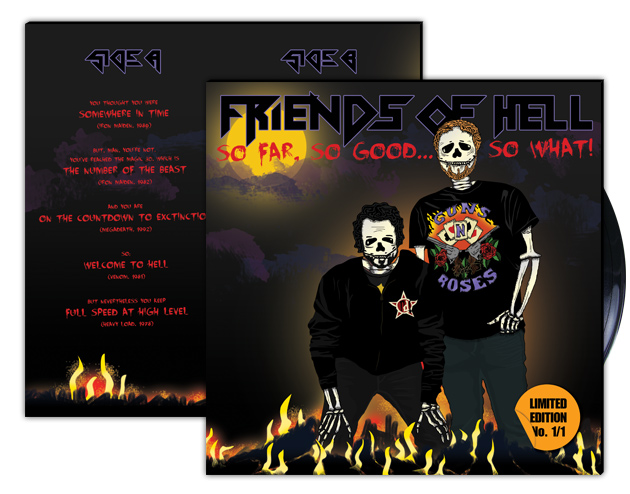
Some weeks ago I was asked to design a LP cover for a colleagues friends birthday. And oh, how i loved it getting deep into the demanded Metal style and lingo – with all its darkness as well as the flashing neon elements that you truly just have to love about a good Metal cover artwork. So here is my hail to Iron Maiden and all the other bands with the crazy hairdoes and hard guitar rythms.

plattencover

Something new, something old.

I wanted to try out some new design and I’m quite happy with it. And of course, having chosen one of my alltime favourite motives, it was double fun working on it! Here’s to John.

john_23-10-2013

A late summer invitation.

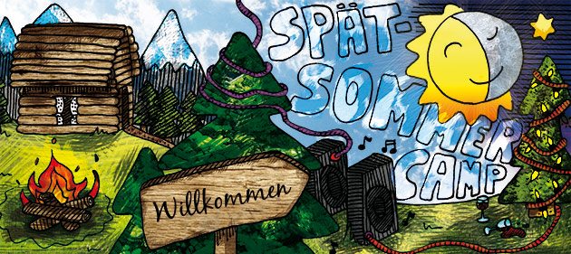
It’s been some time since I made new illustrations. So I was quite happy, having a good reason to pick that up again, when a colleague of mine asked me to design invitations for her late summer party. And that’s how it turned out to be:

sommerfest_neutral

Oh, and by the way: Follow my blog with Bloglovin

It’s leiwand, I guess.

Here is my second attempt in getting a little bit fitter at Adobe Photoshop CS6 3D possibilities. This is not really an original design, as I followed this very good tutorial to master this look. Also the quote is not mine, but I hold it very dearly, since David Petermann, Executive Creative Director at Wunderman PXP, stated this line to have been the most important question when judging the online advertising entries at Cannes. The expression “leiwand”, some of the most notorious Viennese dialect words, meaning “cool”, “easygoing” or “brilliant”.  And I only can very much agree with this quote and pin this sentence next to my computer.

leiwand_630

Typo love.

I spent some time playing around with Photoshop CS6 3D and  added some effects and fonts later in regular 2D mode. It’s a quote from John Lennon’s song “Love”.

love_bearb

Those days in color.

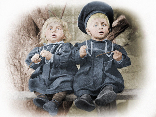
I’m still playing around with the possibilities of colorizing old black and white photographs. Here are two more of my latest attempts: The first one is showing my great-grandfather and his family, the second one two of his sons – one being my grandfather as a baby.

5_

5_bearb

65

65_bearb

My Great-Great-Grandfather.

Another attempt in colorizing old pictures. This time something more personal as this is a picture of my great-great-grandparents with their sons and daughter, somewhat around 1900 in the Czech Republic. It’s one of the oldest photographs our family possesses and I always was especially fascinated by it. I don’t know this people at all, and yet I wouldn’t be here if it weren’t for them. People who lived over a century ago in another country. Family.

2 2_bearb

Freud’s true Colors.

Okay, im officially hooked. Here is another try – this time I’ve taken this popular picture of Sigmund Freud and recolored it. During puberty I had quite an intenisve Freud phase, reading everything about the father of psychoanalysis I could find. This fascination recently got refreshed watching the movie “A dangerous method”. So here’s to him!

freud

Colorized.

It’s not really a new thing around the web or the design community, but I recently started to look into colorisation of old photographs a little bit more. It really fascinates me, how old photographs suddenly look so much livelier and people seem much more real after (simplified spoken) adding some color. Black and white phtography has a thing to let people and places seem to be kind of withdrawn from the real world and like ghosts from a long time ago. And to turn this around and show their real faces has some kind of big magic in it.

I made a first attempt and colorized this old photograph of a broadway actress taken from here. But you can find some really stunning examples by Sanna Dullaway around the web.

oldphoto

Passion.

passion

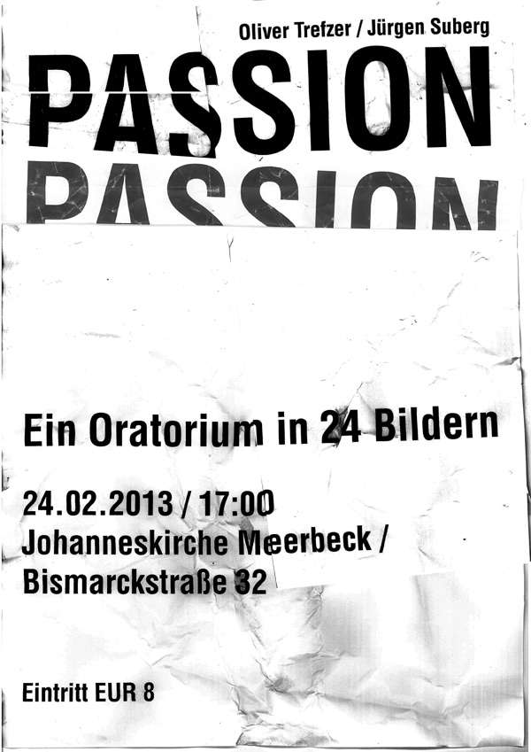
I designed this poster for a concert of some dear friends in Germany. Made mostly by treating paper really bad and a copy machine.